
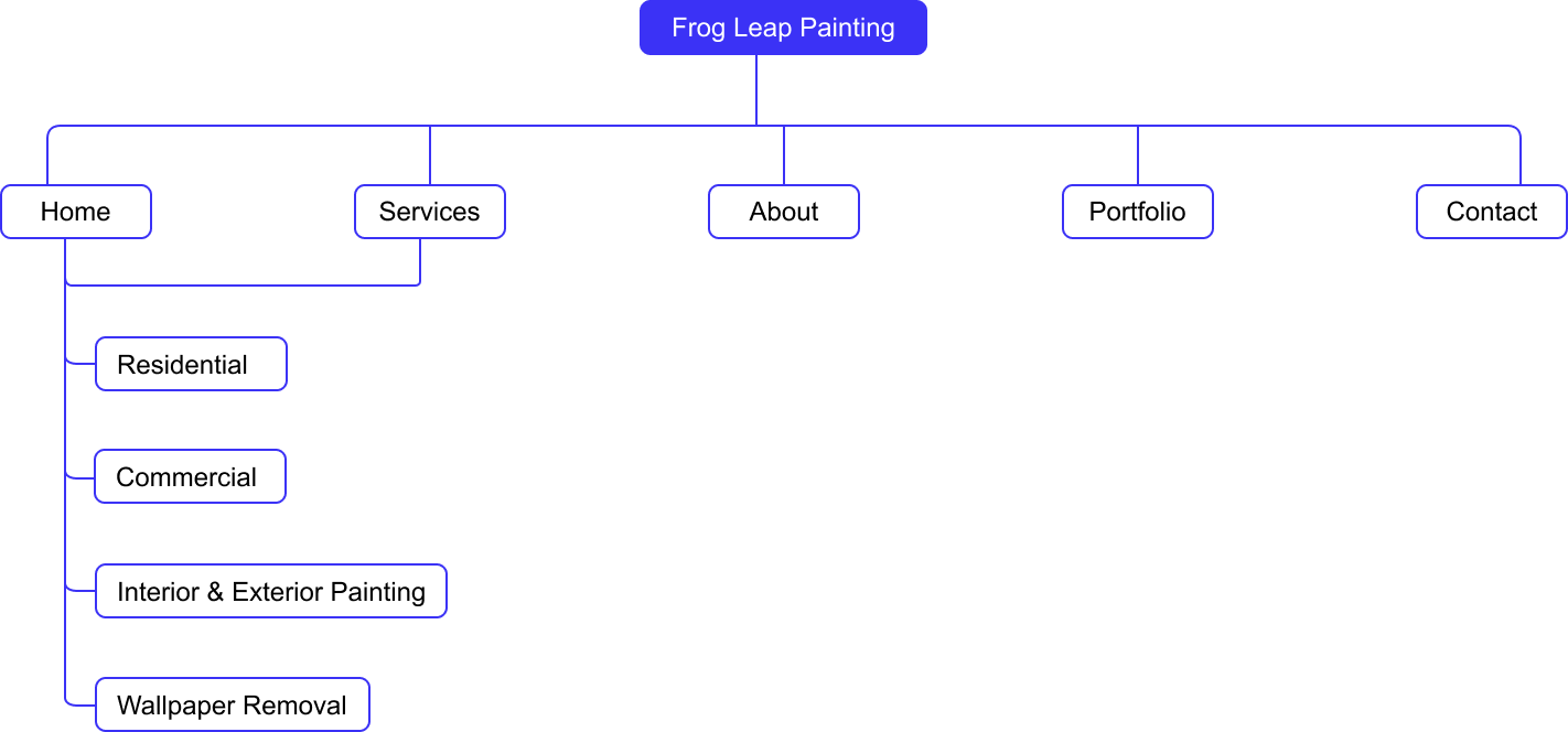
Frog Leap Painting

Home Services
& Painting

Business Website
Website Design &
Lead Generation


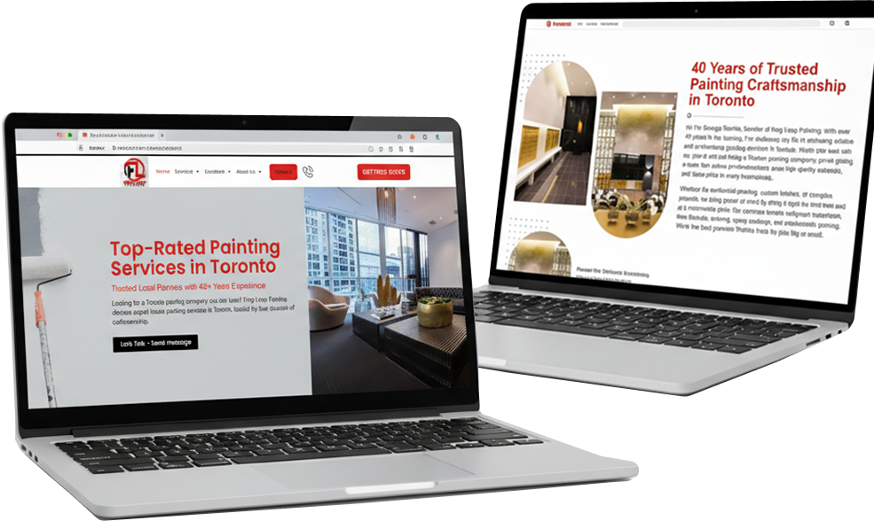
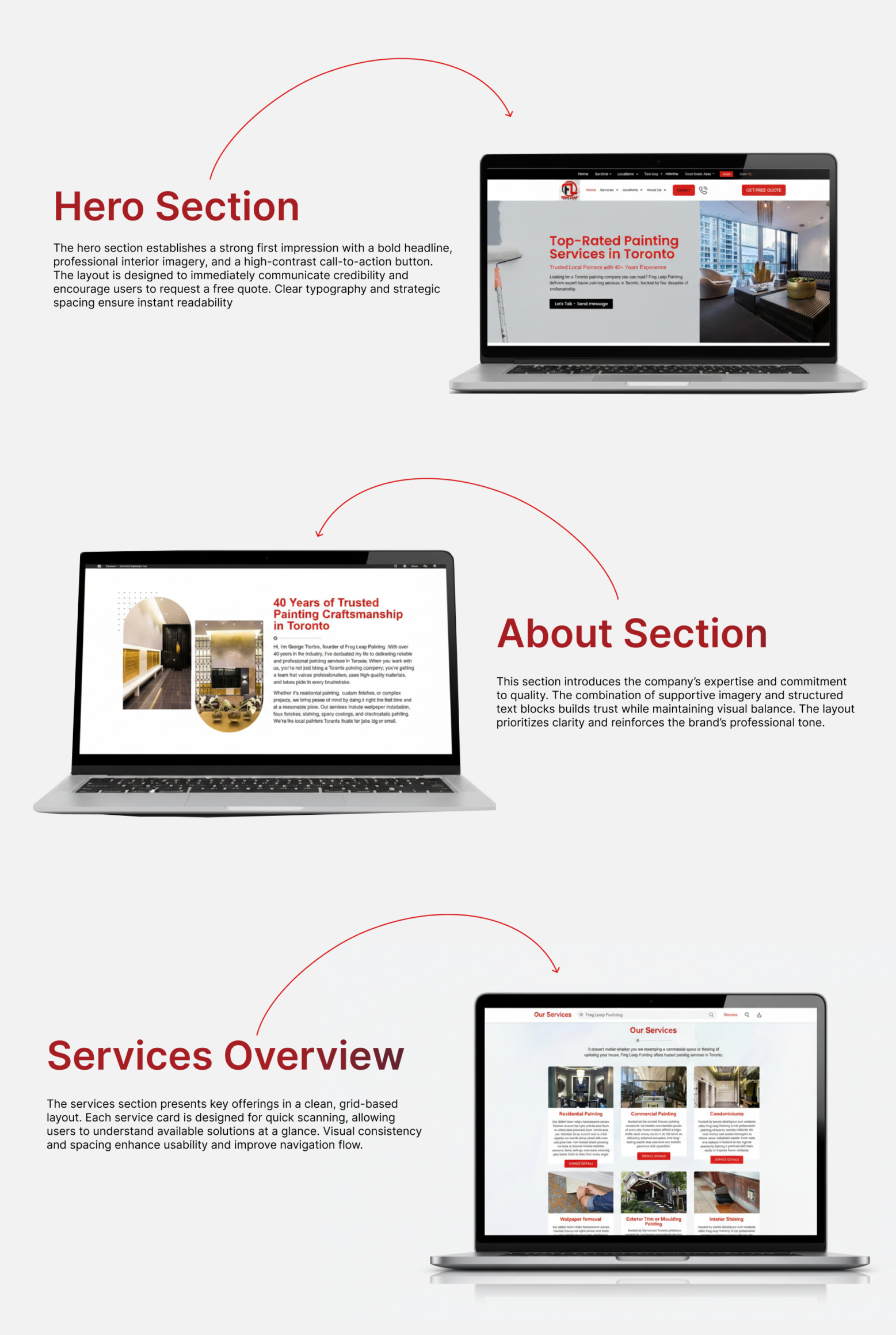
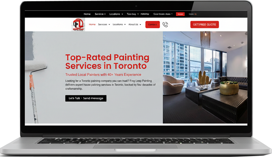
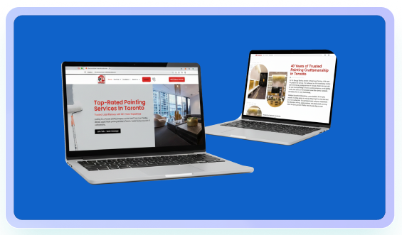
The hero section establishes a strong first impression with a bold headline, professional interior imagery, and a high-contrast call-to-action button. The layout is designed to immediately communicate credibility and encourage users to request a free quote. Clear typography and strategic spacing ensure instant readability
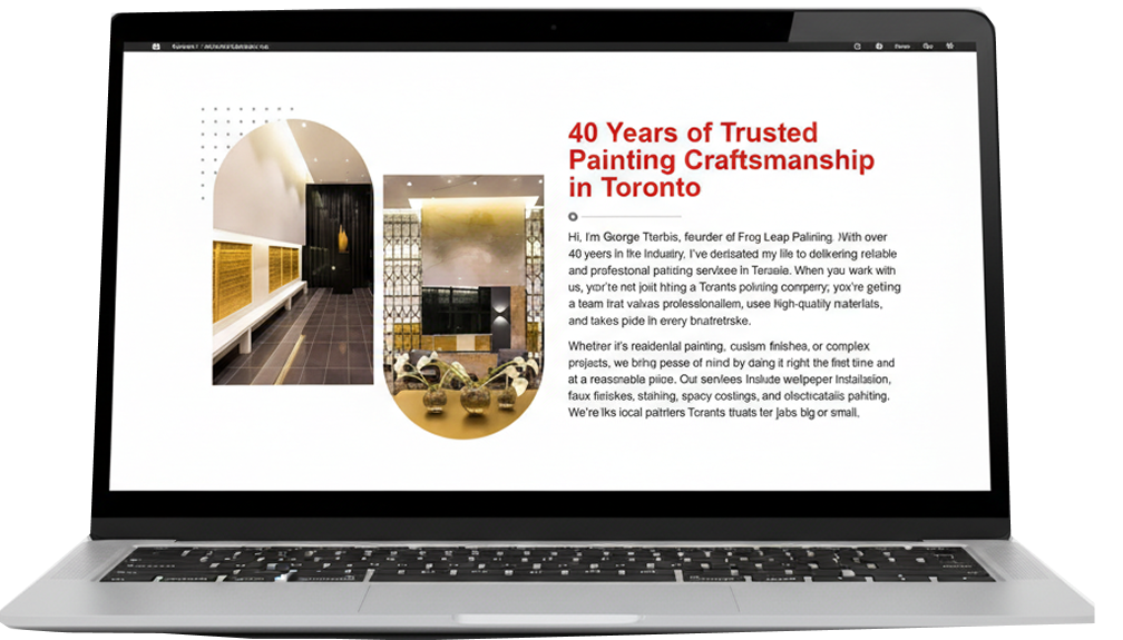
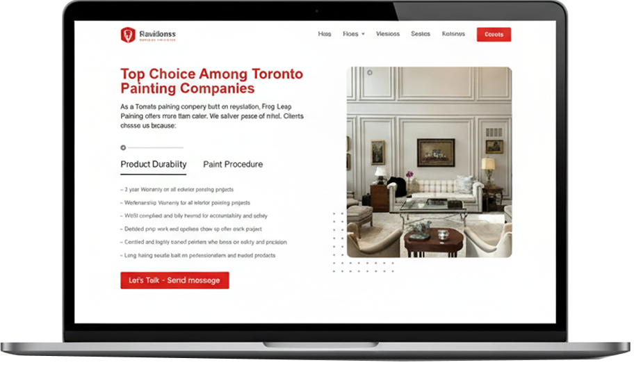
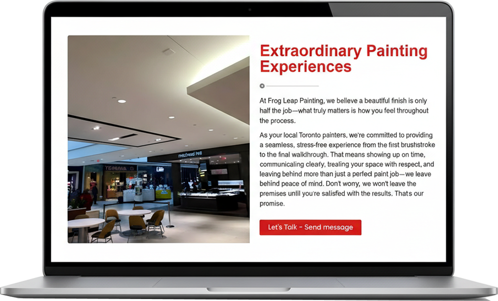
This section introduces the company’s expertise and commitment to quality. The combination of supportive imagery and structured text blocks builds trust while maintaining visual balance. The layout prioritizes clarity and reinforces the brand’s professional tone.
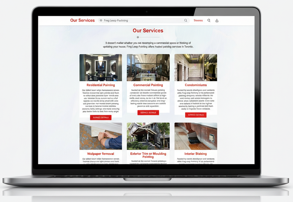
The services section presents key offerings in a clean, grid-based layout. Each service card is designed for quick scanning, allowing users to understand available solutions at a glance. Visual consistency and spacing enhance usability and improve navigation flow.
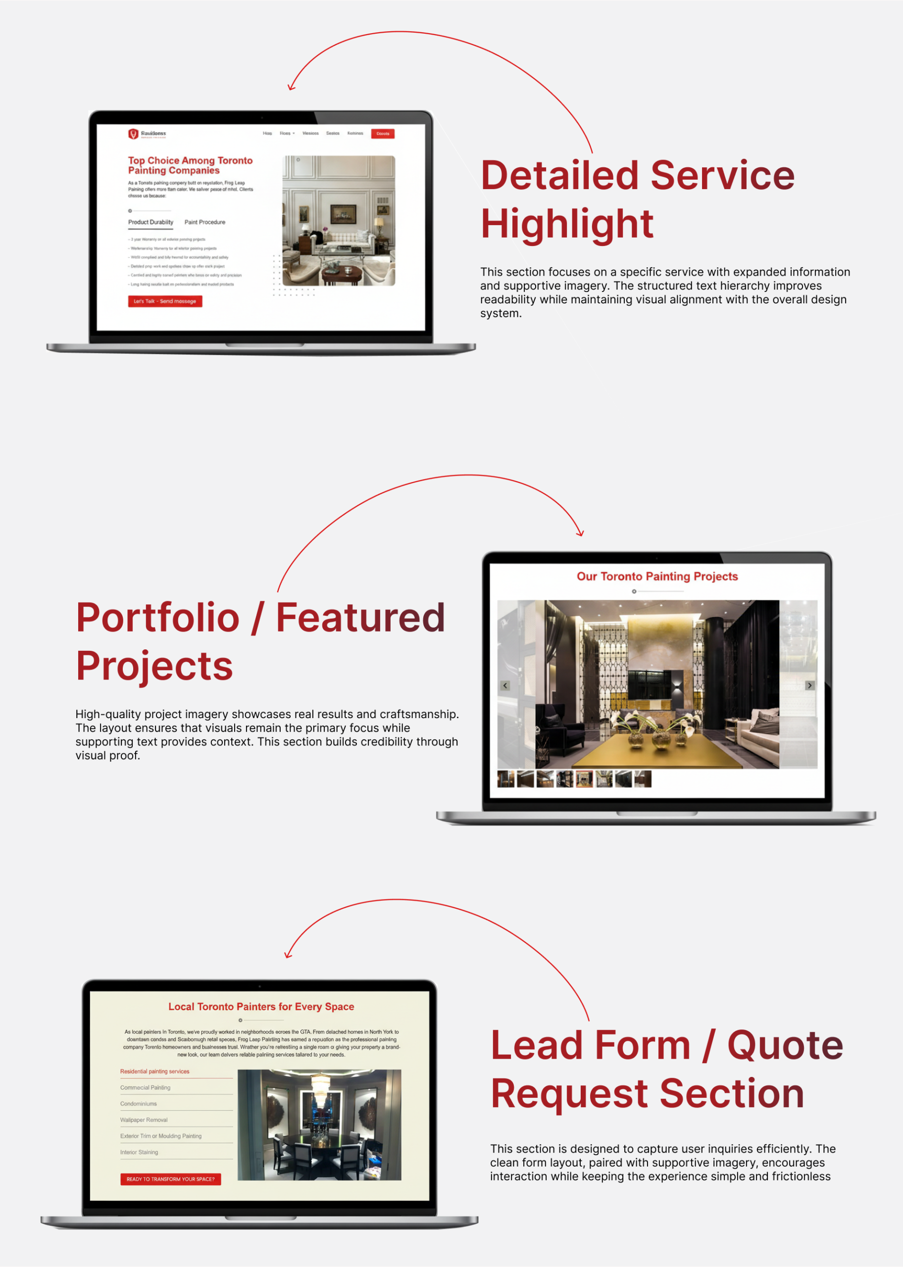
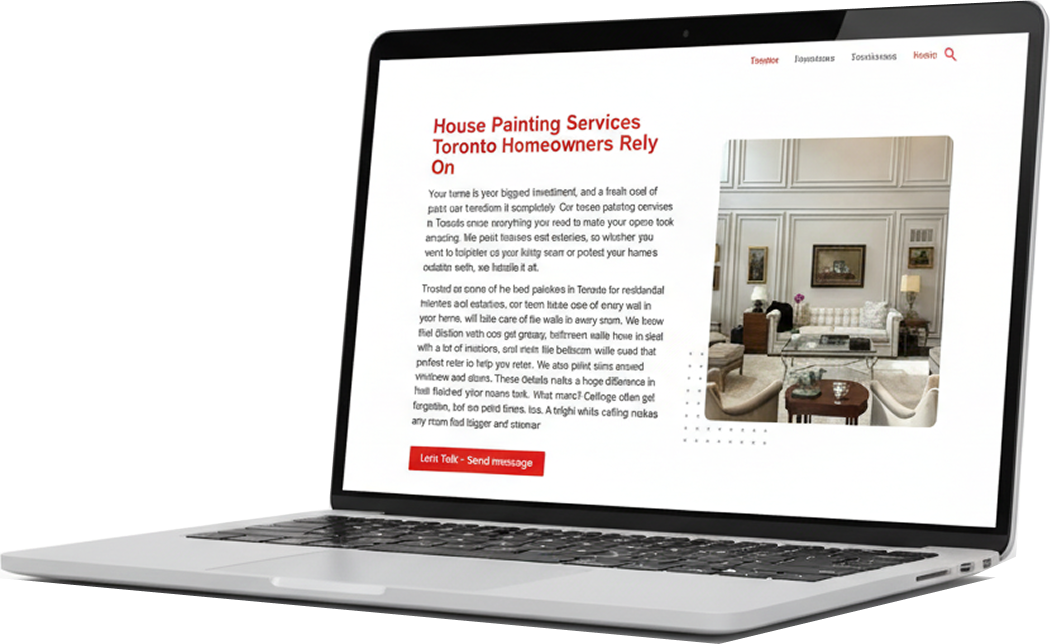
This section focuses on a specific service with expanded information and supportive imagery. The structured text hierarchy improves readability while maintaining visual alignment with the overall design system.
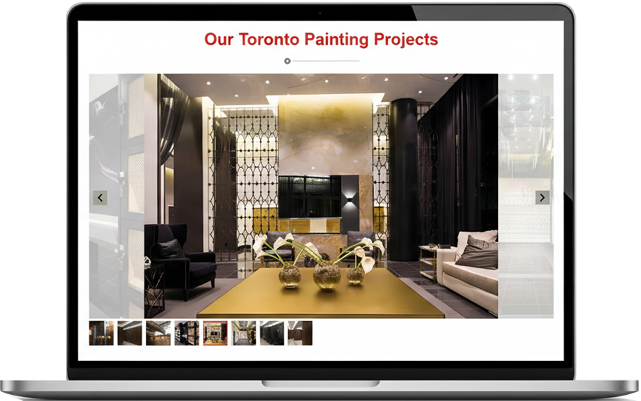
High-quality project imagery showcases real results and craftsmanship. The layout ensures that visuals remain the primary focus while supporting text provides context. This section builds credibility through visual proof.
This section is designed to capture user inquiries efficiently. The clean form layout, paired with supportive imagery, encourages interaction while keeping the experience simple and frictionless
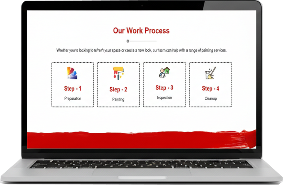
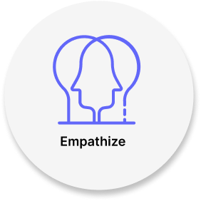
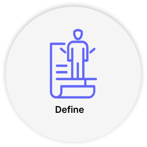
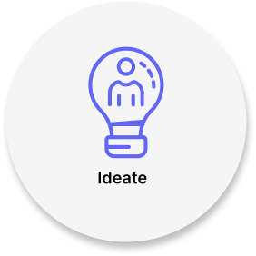
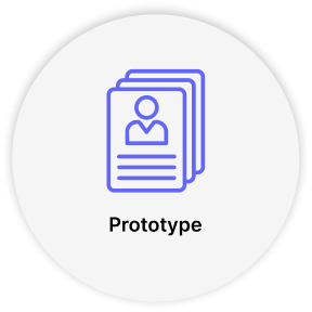
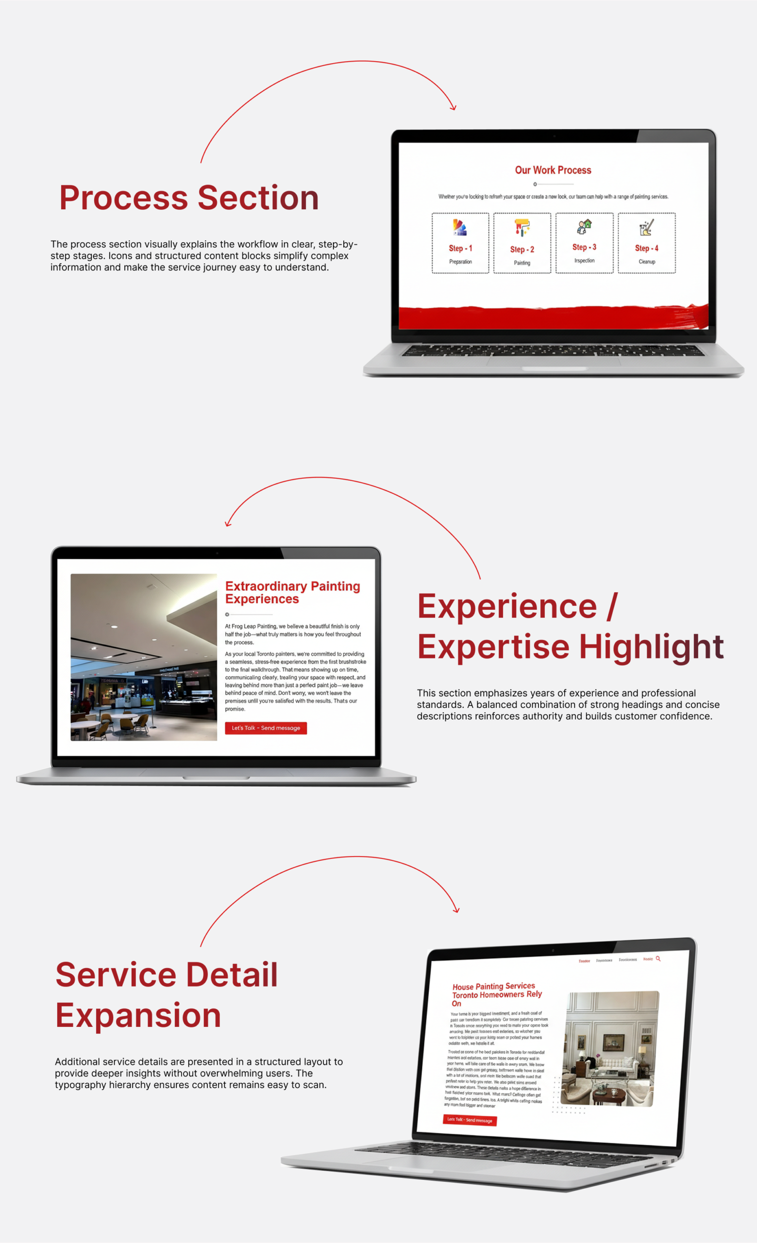
The process section visually explains the workflow in clear, step-by-step stages. Icons and structured content blocks simplify complex information and make the service journey easy to understand.
This section emphasizes years of experience and professional standards. A balanced combination of strong headings and concise descriptions reinforces authority and builds customer confidence.
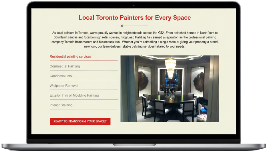
Additional service details are presented in a structured layout to provide deeper insights without overwhelming users. The typography hierarchy ensures content remains easy to scan.
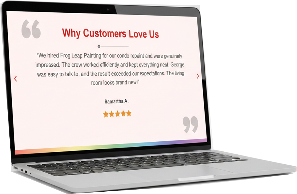
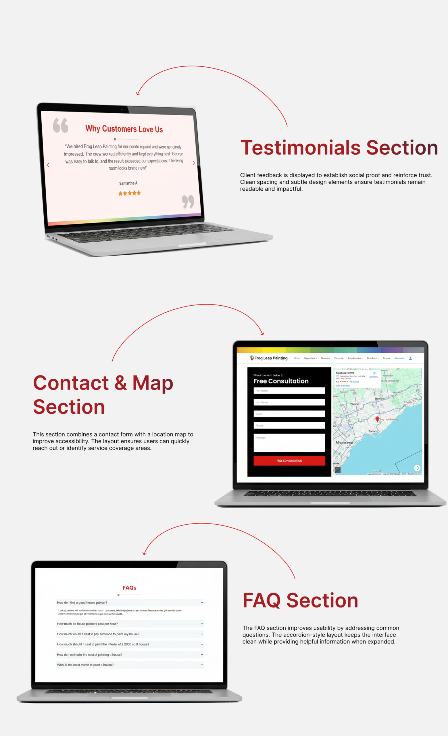
Client feedback is displayed to establish social proof and reinforce trust. Clean spacing and subtle design elements ensure testimonials remain readable and impactful.
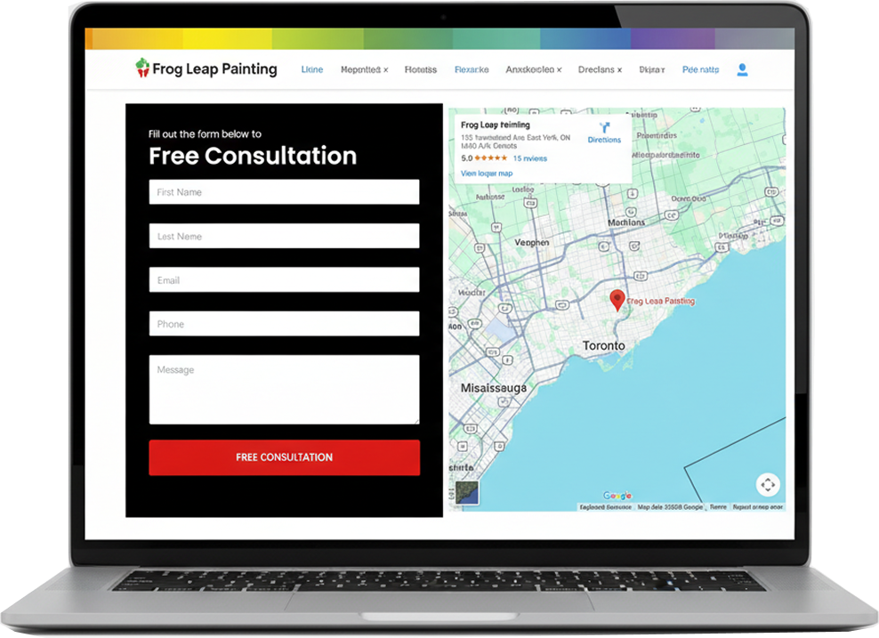
This section combines a contact form with a location map to improve accessibility. The layout ensures users can quickly reach out or identify service coverage areas.
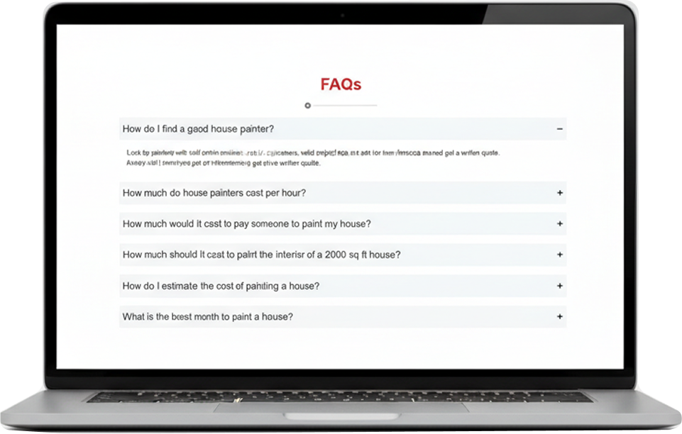
The FAQ section improves usability by addressing common questions. The accordion-style layout keeps the interface clean while providing helpful information when expanded.
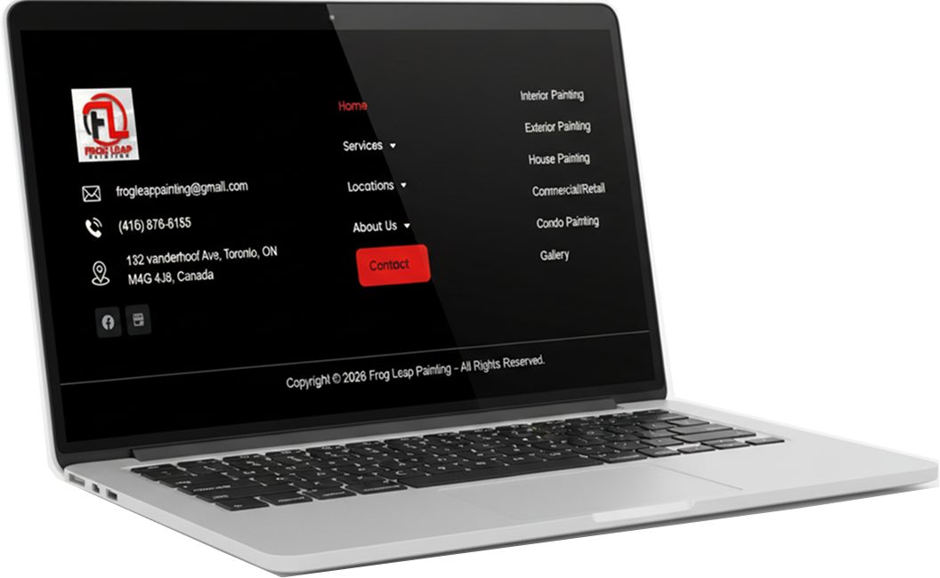
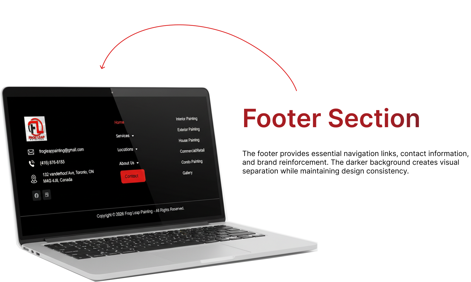
The footer provides essential navigation links, contact information, and brand reinforcement. The darker background creates visual separation while maintaining design consistency.